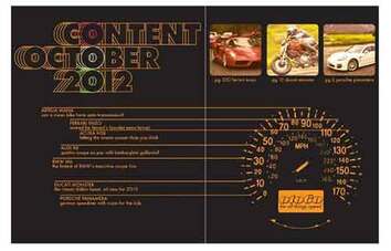
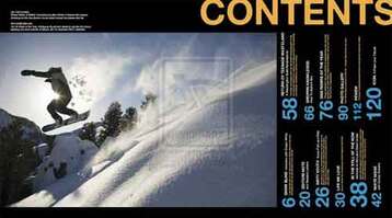
   The reason for choosing the first picture as a possible table of contents layout is because it uses a car speedometer graphic as the page numbers. This is a good thing because my magazine is about cars and other vehicles. This goes with my cover because it displayed a car.
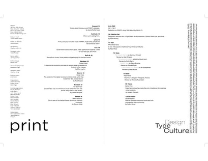
The reason for choosing the second picture is because the layout provides a good opportunity to show a special vehicle from the issue or showcase pictures submitted from the readers. The cover does go with my cover but the color scheme would have to be changed to match my cover. The reason for choosing the third picture is because it provides a good starting point for my table of contents. It is too plain so I would add a graphic(ex. the solid lines that divide the lanes on a road). This table of contents would not go with my cover so some changes like font and color would have to be changed so it does. Some possible article topics could be: "The story of Carroll Shelby", "One man projects you need to see", and "The easiest mods you can do to your car to make it faster."
0 Comments
Write up: The cover contains one photo that takes up the full page with text colored red and black. Title/Masthead: The word title means the name of a piece of work. The title suggests what the work will be about. Typography: The tone given by the text is very energetic. Image: The photo is taken from the front and it's a moving shot of a car, the Chevy Corvette. There is a person in the car but you are unable to make out any detail, only a silhouette. The car is stock and is in great condition. Language: The strapline is "where we headed, we don't need no tire." It suggests that at the end of the day, they enjoy having fun, even if it's a little reckless. 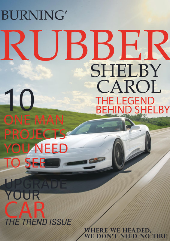 |
 RSS Feed
